Views: 0 Author: Site Editor Publish Time: 2026-06-01 Origin: Site
Premium unboxing experiences play a huge role in customer retention. They directly elevate brand perception. Consumers expect more than a plain cardboard box. Translating a crisp digital brand identity onto thin, translucent paper presents unique challenges. You face specific physical constraints during production. Ink absorption varies wildly on porous surfaces. Opacity levels change depending on the background. Misalignment ruins otherwise perfect designs. Standard printing techniques often fail on such delicate substrates. Successful implementation requires bridging the gap between your aesthetic vision and harsh commercial printing realities. We will explore exactly how to optimize your artwork files. You will discover technical rules for line weights, color modes, and material selection. Understanding these rigid boundaries ensures your final packaging looks sharp and professional. By mastering these design principles, you avoid costly production mistakes. Your brand will confidently deliver an unforgettable unboxing moment every single time.
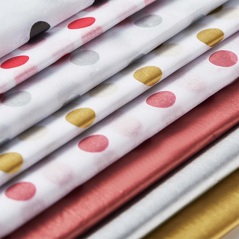
Vector-based, repetitive logo patterns yield the most consistent printing results on translucent materials.
Selecting the right paper weight (GSM) and finish—from matte eco-friendly to high quality metal tissue paper sheets—directly impacts ink saturation and durability.
Designing in CMYK and respecting safety margins prevents costly misalignment and color-shifting errors during mass production.
Evaluating a supplier should involve verifying minimum order quantities (MOQs), ink sustainability (e.g., soy-based), and proofing protocols.
Designing for standard cardstock fails completely when applied to delicate substrates. Cardstock features a coated, solid surface. It holds ink on top of the paper fibers. Tissue paper acts much more like a sponge. It absorbs wet ink rapidly into its core. Understanding this business problem saves companies thousands of dollars in ruined print runs. You cannot treat thin packaging elements like standard brochures or business cards.
Tissue paper possesses a highly porous nature. This directly affects color vibrancy. Lighter colors frequently wash out entirely. They blend into the translucent background. Heavy ink coverage creates the opposite problem. Too much ink saturates the delicate fibers. It severely compromises paper integrity. The material becomes brittle or tears during the folding process. We recommend balancing your ink load carefully. Leave enough negative space to maintain structural strength.
Pantone (PMS) matching behaves differently on translucent surfaces. Standard color swatches assume a solid white background. Solid white reflects light back through the ink. Thin packaging lets light pass entirely through it. This alters how the eye perceives the printed color. Set realistic expectations for inevitable color shifts. A vibrant navy blue might appear slightly muted or grayish when held up to the light. Always review physical samples before approving mass production.
Low-resolution images ruin professional packaging. High-resolution files remain an absolute necessity. You must provide artwork at a minimum of 300 DPI (Dots Per Inch). However, resolution only matters for raster images. Printers hold an absolute preference for vector formats. Vector files end in .AI or .EPS. They use mathematical equations instead of pixels. Vectors ensure your logos and text never lose clarity, regardless of scale.
Creating effective Custom Printed Tissue Paper requires strategic artwork planning. You must adapt your brand assets specifically for repetitive wrapping applications. A single large logo placed in the center rarely works well. The packer will inevitably fold the paper, hiding your main graphic.
Continuous grid, diagonal, or staggered logo patterns serve as the industry standard. This approach creates a scalable, cut-agnostic design. Cut-agnostic means the paper functions perfectly regardless of where scissors slice it. The customer sees your brand clearly from any angle. To build a successful step-and-repeat pattern, follow these guidelines:
Select a simplified version of your primary logo.
Establish a uniform distance between each element to avoid a cluttered look.
Rotate alternate rows slightly if you want a dynamic, diagonal aesthetic.
Test the pattern by printing it on standard office paper and folding it around a mug.
Designers generally choose between two distinct coverage styles. Minimal spot-printing leaves most of the paper blank. It places small logos at set intervals. This method offers a clean look and carries a lower risk of ink bleed. Flood-printing covers the entire sheet in a solid background color. It creates a high-impact, premium aesthetic. However, flood-printing requires higher GSM paper to handle the moisture. It also demands expert ink curing to prevent the color from rubbing off onto your products.
Thin lines often vanish during the printing process. Fine text breaks up or disappears entirely. You must adhere to minimum line thickness requirements. We typically define this absolute minimum as 0.5pt. Bolder fonts perform significantly better than delicate scripts. If you use a serif font, inspect the thinnest parts of the letters. Ensure they meet the 0.5pt threshold. Expanding your text into outlines before submitting the file prevents missing font errors.
The substrate you select dictates the final look just as much as the artwork. Thicker materials convey luxury but cost more to ship. Thinner materials feel standard but tear easily if handled roughly. You must balance visual appeal against functional durability.
Paper weight uses the GSM (Grams per Square Meter) measurement system. Choosing the correct GSM prevents structural failures. Standard lightweight options sit around 17-18 GSM. This weight suits basic apparel, soft goods, and internal shoe stuffing. Heavier weights reach 28 GSM or higher. Use heavier options for luxury goods, sharp-edged cosmetics, or designs requiring heavy ink loads. The thicker paper prevents dark colors from bleeding through the opposite side.
Brands seeking maximum visual impact often choose metallic finishes. Specific use cases for High Quality Metal Tissue Paper Sheets include limited edition product drops and VIP unboxing experiences. These sheets utilize a foil-stamping process rather than traditional wet ink. This application process demands simpler vector designs. Fine details easily merge together when stamped with hot foil. Keep your logos bold and space them generously. The premium reflective aesthetic easily justifies the stricter design constraints.
Consumers increasingly demand environmentally responsible packaging. You can meet these sustainability demands without sacrificing design quality. Discuss the commercial value of utilizing acid-free paper with your supplier. Acid-free materials do not yellow over time and protect delicate garments. Request FSC-certified materials to ensure responsible forestry practices. Specify soy or water-based inks instead of petroleum-based alternatives. These choices improve recyclability and provide excellent marketing copy for your brand.
Seasonal peaks offer excellent opportunities to refresh your unboxing experience. However, entirely redesigning your materials causes brand confusion. You must carefully modify existing assets to celebrate the season.
Adapt core brand elements without entirely losing brand recognition. If your primary logo sits inside a circle, change the circle to a subtle wreath. Do not change your typography or primary logo shape. Maintaining familiar brand architecture ensures returning customers instantly recognize your shipments. Scalability means applying minor festive tweaks that complement your established visual identity.
Incorporate subtle seasonal colors directly into your standard step-and-repeat grid. You might swap a standard black logo for a rich metallic gold during your holiday packaging runs. Secondary branding works exceptionally well here. Introduce a tiny, stylized snowflake or star alongside your main icon. Keep these seasonal additions minimal. The packaging should still feel like it belongs strictly to your brand, rather than a generic seasonal supply catalog.
Seasonal print runs carry significant inventory forecasting risks. Over-ordering heavily dated designs wastes precious capital. If you print "Happy Holidays 2024," any leftover stock becomes unusable in January. We advise designing "winter-themed" artwork over specific holiday text. Pine trees, geometric ice patterns, and silver foil extend your usable shelf life well into February. This strategy mitigates financial loss if Q4 sales fall short of projections.
Printers routinely reject artwork files for entirely preventable technical errors. These rejections delay production timelines and push back your launch dates. Understanding technical formatting saves time and frustration.
Standard bleed requirements ensure your design extends past the cut line. Industrial trimming machines lack millimeter precision. If text sits too close to the edge, the blade clips it. You must define a safety margin inside the final trim size. Keep all critical logos inside this safe zone. Extend background colors outward to fill the entire bleed area. This prevents ugly white borders on the final trimmed sheets.
Artwork Issue | The Result During Printing | The Professional Solution |
|---|---|---|
Missing Bleed Area | White, unprinted borders appear randomly on the edges. | Extend background patterns 0.125 inches past the cut line. |
Low-Resolution Raster Files | Logos appear blurry, pixelated, and unprofessional. | Submit fully scalable .EPS or .AI vector files instead. |
Complex Drop Shadows | Shadows turn into muddy, dotted messes on the paper. | Use solid, flat colors without any transparency effects. |
Hairline Strokes | Thin graphical elements disappear entirely on press. | Thicken all strokes to a minimum weight of 0.5pt. |
The color mode conversion trap ruins many designs. Screens display colors using the RGB (Red, Green, Blue) light spectrum. Commercial presses print using CMYK (Cyan, Magenta, Yellow, Key/Black) inks. Submitting RGB files intended for screens causes massive problems. The printer software automatically converts them to CMYK. This forced conversion results in dull, muddy prints. Neon greens turn into dark olive. Bright blues turn into purple. Always design and export your files in CMYK from the beginning.
Digital gradients look beautiful on a monitor. They rarely print well on translucent paper. Thin substrates handle ink saturation poorly. Subtle color blends turn into visible, ugly bands of color. Halftone dots become blurry. We strongly advocate using solid spot colors instead. Flat vectors provide crisp, predictable results. If you must show depth, use a solid lighter color next to a solid darker color. Avoid smooth digital fades completely.
Your design is only as good as the facility printing it. Choosing a reliable manufacturing partner ensures your digital files translate properly into physical assets. Do not choose a vendor based entirely on the lowest quoted price.
Always evaluate a supplier's proofing process. Advise your purchasing team to insist on digital PDF proofs before agreeing to anything. A digital proof shows exact trim lines and safety margins. For large-scale runs, demand physical proofs. Physical proofs let you test the actual paper weight. You can evaluate ink opacity and color shifts in real life. Never skip the proofing stage to save a few days.
Analyze the Minimum Order Quantities (MOQs) offered by different vendors. Low-MOQ digital printers provide excellent avenues for testing new designs. They require less upfront capital but charge a higher price per unit. High-MOQ offset or flexo printers demand large volume commitments. However, they offer vastly superior unit economics for scaling your business. Choose the production method that aligns with your current inventory turnover rate.
Consumers notice greenwashing immediately. Highlight the importance of verifying a supplier's environmental claims. Do not accept vague "eco-friendly" badges pasted on a website. Ask for actual FSC certification numbers. Request documentation proving they use soy-based or water-based inks. A reputable print provider will gladly share their compliance certificates. Verified sustainability strengthens your brand messaging and builds consumer trust.
Beautiful custom tissue paper is the direct result of adhering strictly to print specifications. You cannot ignore material realities and expect premium outcomes. Respecting line weights, color modes, and physical margins guarantees consistency. Your unboxing experience represents the only physical touchpoint you have with an e-commerce customer. Make it count.
Audit your current artwork files immediately. Perform a strict vector check and confirm your document sits in CMYK color mode. Thicken any hairline fonts. Next, reach out to short-listed vendors and request physical sample packs. Touching the paper allows you to evaluate GSM weight and ink quality firsthand. Taking these action-oriented steps ensures your next packaging run elevates your brand flawlessly.
A: Printers require vector files for the sharpest results. Submit your artwork as an .AI, .EPS, or high-resolution vector PDF. Vector formats use mathematical paths, meaning your logo will never become pixelated or blurry during production. Avoid submitting standard JPEGs or PNGs whenever possible.
A: Printing raster photographs on thin, porous paper presents extreme technical difficulties. The ink spreads, making fine photographic details look blurry and muddy. We strongly advise against photographs. Steer your creative direction toward solid colors, flat illustrations, and crisp vector typography instead.
A: Custom seasonal runs usually require ordering three to four months in advance. Global supply chains, proofing cycles, and peak manufacturing seasons cause significant delays in Q3. Finalize your artwork in July or August to ensure delivery well before the late-year retail rush.
A: Recyclability depends heavily on the materials used. Uncoated paper printed with soy or water-based inks is widely recyclable and often compostable. However, applying petroleum-based inks, heavy plastic laminates, or metallic foil finishes usually renders the paper non-recyclable in standard municipal facilities.